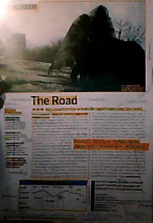
My overall plan for the magazine is for it to be simple, visually, so it attracts all types of a broader target audience; however for it to interest and entice our older readers the language used will be formal. My ideas came from the magazine 'Screen'.
Example
the example to the left is the format i would like to follow but not copy for our magazine idea, i like the fact it has a simple format and a big picture to draw the attention of the readers.
As it includes all the technical codes that i wanted present to make a standard conventions of a film magazine review. The style of the magazine is for it to include most technical codes and to be presented through the layouts. It will include a section title- ' Filming Britain' and a graphic logo which i think should be a 'star'. A headline will also be included which i believe will be called 'Deception' and a strap line ' social networking the hidden truth' i will not include a sub heading however a breakout paragraph will be used so the readers can read on and the formal language will be more digestible. Columns will be used and i thought 2 was a good idea. Pictures also will be included and it would be a scene from the movie. It will contain breakout boxes and i think facts and figures of the dangers online will be best to put in this magazine as it is aimed at the parents and will be suitable for our mode of address and also issue info will be included.
The written codes will be formal, suitable for adult readers this idea came from a film review from 'Film of the month' with a review for a film named ' A time to love and a time to die'.


No comments:
Post a Comment