
Friday, 6 January 2012
Final product of the magazine film review
Thursday, 5 January 2012
Magazine draft layout ideas

The example to the left was our first draft idea, the layout is simple and would attract our target audience however there were some missing semiotics that i wanted to include, this idea would be similar to our final draft but some of the breakout boxes might be positioned in different places.
.JPG)
Draft two
This was our second example, the format was not suited our target audience however the written codes and columns attracted me as it would suit the target audience more.
.JPG)
This is the design we decided to go for because it Incorporated the first design as it is simple however we took the written codes from the second design above these were only drafts however the one shown to the right is close to our final as we believe it is perfect for our target audience.
Wednesday, 4 January 2012
Sample paragraphs for mode of address
'Educational production that excels other short film, challenging and exploring a common issue'
'A hidden truth that exploits one of the main issues in British teenage society.'
These sample sentences will be used in the reviews and commentary that other company's would say about the short film.
'Missail Aziz and Julie Sernat are back in a starring educational epic exploiting a common British issue , that many of the teenagers in our society have to face.'
This is sample sentences that would be used in the introduction.
Our mode of address is for a much older audience ie the parents of the school kids that are in danger the language has to be formal sophisticated and be interesting enough and well written to attract and inform the educational message we are trying to get across.
Tuesday, 3 January 2012
Example headlines and Breakout boxes
First headline- 'People are not who they seem'
Second headline-'social networking, the hidden truth'
Third headline-'The internet should not be your best friend but enemy'
I think the second headline is the most suitable one for our target audience and two it entices a reader to read the review unlike the others.
Example breakout boxes:


 1. The picture taken from a sun newspaper as back up to our issue within the British society, it would be good to use in a breakout box as its more evidence for parents and teachers to see that the topic does happen and is written about but action needs to happen.
2. The second picture is a parents guide to internet language , placing it in our magazine would be very helpful as parents will be able to indicate if there is anything said that might put their child at danger this is a valuable picture as it informs the readers.
3. could be a picture alongside the main picture just to catch the audiences eyes to the review to attract them to read the article and watch the short film.
Second headline-'social networking, the hidden truth'
Third headline-'The internet should not be your best friend but enemy'
I think the second headline is the most suitable one for our target audience and two it entices a reader to read the review unlike the others.
Example breakout boxes:


2. The second picture is a parents guide to internet language , placing it in our magazine would be very helpful as parents will be able to indicate if there is anything said that might put their child at danger this is a valuable picture as it informs the readers.
3. could be a picture alongside the main picture just to catch the audiences eyes to the review to attract them to read the article and watch the short film.
Monday, 2 January 2012
Audience profile
Our target audience for our magazine film review is aimed from teenagers 14 on wards so it has to be sophisticated but simple our magazine film review is formal so the questions should be surveyed for both adults and teenagers:
Where do they live ?
They will be living at home with their parents or studying at university.
What are there hobbies?
On the internet constantly or any other media device i.e smartphone, ipad, television and socializing.
What do they use the internet for?
keep in touch with world events
How often do they use the internet and for how long?
Regular users for social purposes
Do they have a social networking site and if so which one ?
Mainly Facebook users and some others like twitter, Bebo tumblers and blogs.
Do they accept unknown friend requests ?
yes
Sunday, 1 January 2012
Magazine film review (planning)
My overall plan for the magazine is for it to be simple, visually, so it attracts all types of a broader target audience; however for it to interest and entice our older readers the language used will be formal. My ideas came from the magazine 'Screen'.
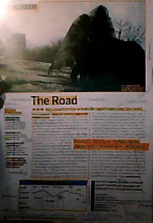
Example
the example to the left is the format i would like to follow but not copy for our magazine idea, i like the fact it has a simple format and a big picture to draw the attention of the readers.
As it includes all the technical codes that i wanted present to make a standard conventions of a film magazine review. The style of the magazine is for it to include most technical codes and to be presented through the layouts. It will include a section title- ' Filming Britain' and a graphic logo which i think should be a 'star'. A headline will also be included which i believe will be called 'Deception' and a strap line ' social networking the hidden truth' i will not include a sub heading however a breakout paragraph will be used so the readers can read on and the formal language will be more digestible. Columns will be used and i thought 2 was a good idea. Pictures also will be included and it would be a scene from the movie. It will contain breakout boxes and i think facts and figures of the dangers online will be best to put in this magazine as it is aimed at the parents and will be suitable for our mode of address and also issue info will be included.
The written codes will be formal, suitable for adult readers this idea came from a film review from 'Film of the month' with a review for a film named ' A time to love and a time to die'.

Subscribe to:
Comments (Atom)